by Fronetics | Jan 29, 2018 | Blog, Content Marketing, Logistics, Marketing, Supply Chain
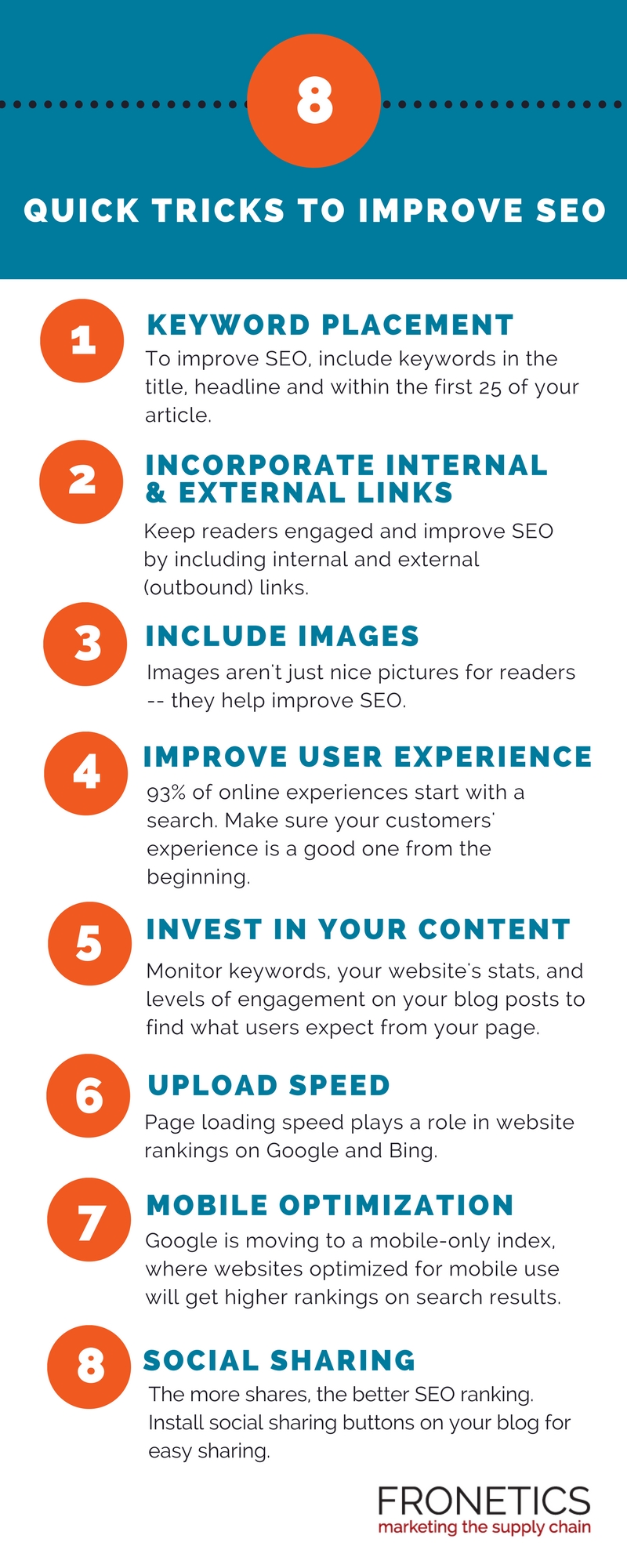
Use these 8 quick tips in your blog posts to improve SEO and help your target audience find your content.
Search engine optimization: It’s a phrase every blog writer looking to grow readership has wrestled with at one time or another. Part science, part art, SEO writing can evade even the most seasoned blogger. You want people searching the internet to find your blog, but you also want readers to enjoy your posts and not feel like they’re written for machines.
Search engines continue to evolve and improve their algorithms to make sure readers are finding exactly what they’re looking for. Never artificially stuff your posts with keywords, links or images. Search engines, like Google, penalize webpages that use sneaky techniques, like keyword stuffing, by demoting or even removing their pages from their indexes.
Ultimately, if you want to improve your SEO, your content needs to be value to your target audience. That should be your priority when planning and producing content like blog posts. But you can also keep these quick tricks in mind to optimize your posts, and thus increase the likelihood internet searchers will find them in the first place.
Infographic: 8 quick tips for blog posts to improve SEO

(Made with Canva)
Using these 8 quick tips will improve SEO and get your blog posts in front of your target audience. Remember, your best bet on moving up on search engine results pages is to create content that readers want to read. Sounds simple, I know, but it can be challenging. Let us know how these tips helped improve your SEO.
Related posts:

SaveSave

by Fronetics | Jun 2, 2016 | Blog, Content Marketing, Marketing

As the prevalence of smartphones increases, businesses must consider how their emails appear on mobile devices.
You may have created a marketing email masterpiece, but how will it look when someone reads it on a cell phone? This is a very real concern, considering that 56% of email opens occur on mobile devices.
The ubiquity of smartphones has changed our relationship with email. The 72% of American adults who own smartphones are checking email much more frequently throughout the day. This equates to better chances for your brilliant marketing email to be seen and read.
But, the caveat is that your email, which is typically designed to be read on a laptop or desktop computer, must be easy to read on any device. If you send a marketing email that is not optimized for mobile, more than half of your recipients are straining and struggling to read your content. You’ve given them a good reason to delete it instead of reading it.
Here are a few tips for optimizing emails for mobile:
Keep it short and sweet.
Your message should be well articulated but simple. Keep paragraphs short and concise, and put all of the most relevant facts first.
Don’t picture this.
When it comes to images, less is more. Android devices automatically block images unless the user changes their settings. And for those who do see your image, it’s rarely optimized for their specific phone, since shapes and sizes of mobile screens vary. It becomes work for your reader to try to shrink or enlarge the image to see the whole message. Also note that when you embed large image files, they may take an excessively long time to load.
Hello. It’s me.
Be very concise with your “subject” and “from” lines, which are super-condensed on cell phones. For example, an iPhone (held vertically) only displays the first 25-30 characters of a subject line. Often, sender’s name is boldfaced and the first thing the reader sees. Make it easily recognizable!
Responsive: your new best friend.
Choose a “responsive” template, which will automatically fit an email to the screen on which it’s being viewed. This assures you that your marketing email will look the way you intended, whether it is viewed on a smartphone, tablet, laptop, or desktop computer. WordPress has pre-built themes that incorporate responsive design elements. Unfortunately, there’s no simple plugin to make a non-responsive template responsive.
Button up.
Avoid adding links. Use a button instead for your call-to-action. Make sure to set plenty of space around it, so it is easy to click without accidentally clicking something else. Buttons essentially prove to be much easier for people to click on when using a touchscreen.
Keep in mind: With 98.4% of the market share today, Android and iOS are the operating systems your emails typically will be viewed on.
To remain competitive, your marketing email designs must be optimized for mobile to remain consistent across multiple devices. It is wise to test how your emails look on different devices to see how they appear on each screen. But most importantly, choose a template that is responsive, and make these five tips a regular part of your email marketing strategy.
Related posts:


